
Interactive workforce atlas
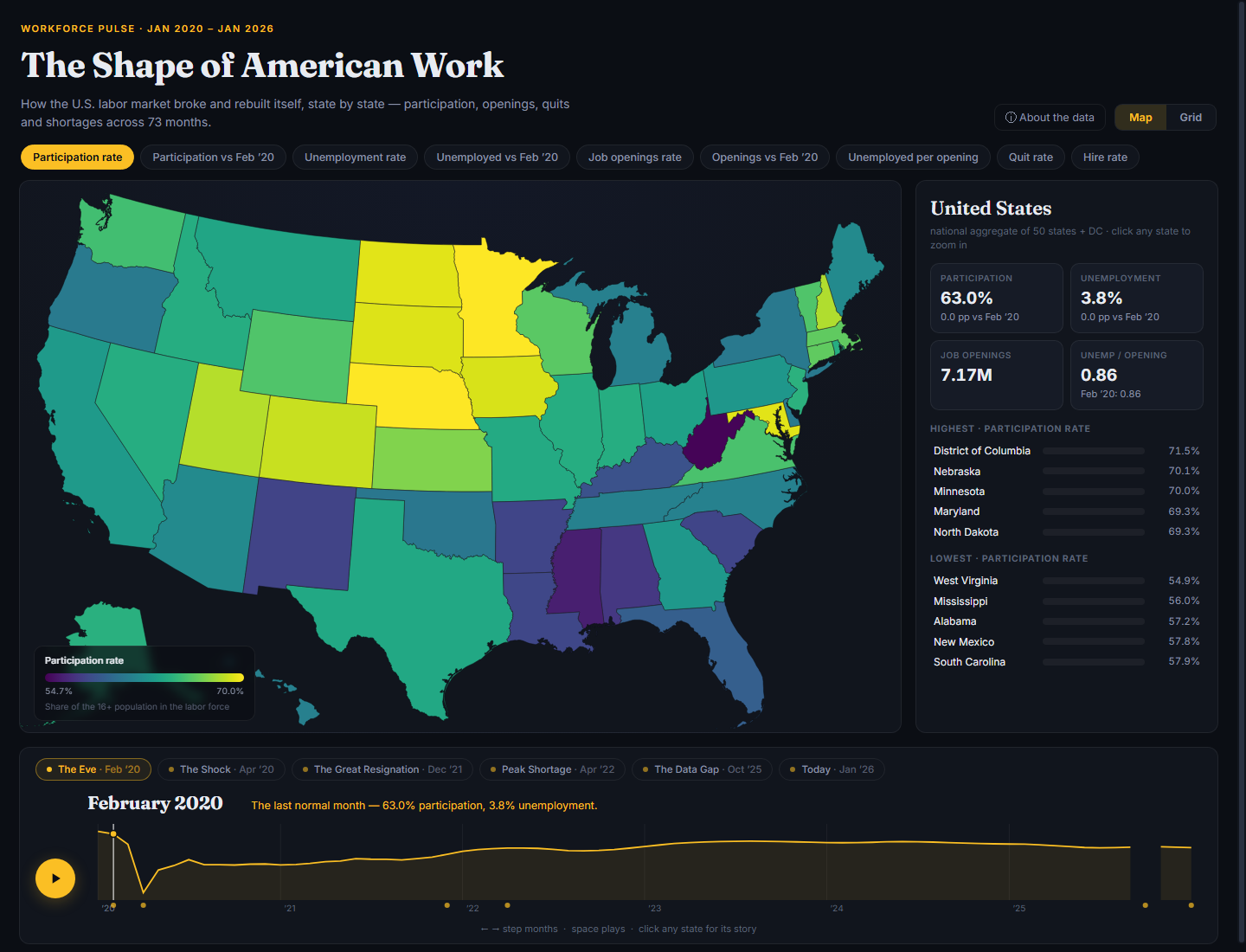
An interactive D3 atlas comparing U.S. state labor-market patterns from January 2020 through January 2026.
What I did
I built an atlas with geographic and tile-grid maps, linked trend charts, time controls, state profiles, and shareable views.
Result: The published application covers 50 states and Washington, DC across 73 monthly periods. Visitors can compare metrics, animate the timeline, inspect state trends, and share a selected view. The app and source are available on GitHub.
Tools
- JavaScript
- D3
- TopoJSON
- Data visualization
- Interactive maps
The app uses a fixed dataset snapshot, not a continuously updated feed. Missing observations remain visible as gaps.
Project gallery
Screenshot from the published workforce atlas. 1 images. Select an image to view it full size.
Technical details
Independent portfolio project
A single static chart makes it difficult to compare changes across states, dates, and labor-market indicators.
- Read the monthly CSV snapshot and preserve missing observations as gaps.
- Calculate national rates from summed state counts instead of averaging state percentages.
- Keep color scales fixed across the time series so map colors remain comparable during animation.
- Synchronize the metric, month, selected state, and map view through a shared application state and URL hash.